
REDESIGNING LENDIFY’S LOAN APPLICATION
ABOUT LENDIFY
Lendify was a Community Development Financial Institution (CDFI) that provided affordable, credit-building loans to working families in America. While Lendify offered loans directly to customers through an online channel, its main product was sold through partnership stores. Therefore, the primary user of their retail product was partner associates as opposed to loan customers.

PROBLEM
Built as an MVP for the initial company launch, the retail loan product was not optimized for the user or their environment. The long application time, technical complications, and lack of guidance left many users feeling apprehensive, unmotivated, and confused. In addition, the company was spending a lot of resources on service phone calls, leading to user frustration and high company overhead, and an inability to grow larger partnerships.
OUTCOME

An entire redesign of the loan application validated through user research and company success metrics.
Company KPI’s:
Decrease application time by 20%
Post redesign: decreased by 21%
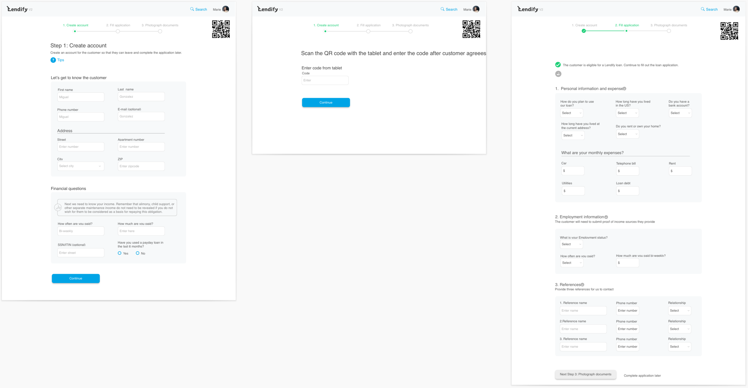
The application experience was shortened from 21 screens down to 10 and was designed as a long page vs. carded flow.
Increase loan volume by 18%
Post redesign: Agent productivity and larger partner interest led to a 23.4% sale increase. We later signed a contract with H&R Block due to our new and improved product.
Reduce call center costs by 3%
An intuitive experience with more user guidance led to fewer phone calls and a decrease in calling cost by 2.7%.
Even though we did not hit this KPI, we did see over time a decrease in calls as users become more comfortable with the redesigned product. Within a couple of months, 81% of our users were confident to complete the application without help.
MY ROLE
Product Designer & UX Researcher (in collaboration with Product Designer Tara Chandi)
DURATION
3 Months
DESIGN PROCESS
01. DEFINE
Before jumping straight into designs, we needed to understand:
Who are we designing for?
After speaking to different stakeholders, we knew that the primary user was our Partner Agents. However, we still needed to keep the customer’s experience in mind, since they would also interact with the interface for certain actions (eg. sign disclosures).
What are the project goals beyond KPI’s?
A successful redesign was tracked through the KPI’s, but we also needed to be able to grow our product from a design and engineering perspective.
Scalable UI - A flexible, white-label UI that could scale as we grew and partnered with more companies.
Efficient codebase - We needed to minimize engineering effort by reconstructing our backend to allow for rapid releases.

02. DISCOVER
Now that we had a better understanding of the company goals and users, we now wanted to look at the current experience from the lens of our users to make sure we design around their challenges and goals.
EXAMPLES OF THE desktop screens BEFORE REDESIGN


We started research by conducting qualitative interviews and quantitative surveys.

Photo taken with two of our users after an in person interview.

A glimpse into an agent interview.
The outcome of the research was this experience map. Within the map, you’ll see guiding principles that were used to guide our decisions, feelings in which we wanted to convey during each step of the process, common scenarios, and possible solutions to improve the current experience.
(Click on the image to view it in a separate window.)

03. IDEATE
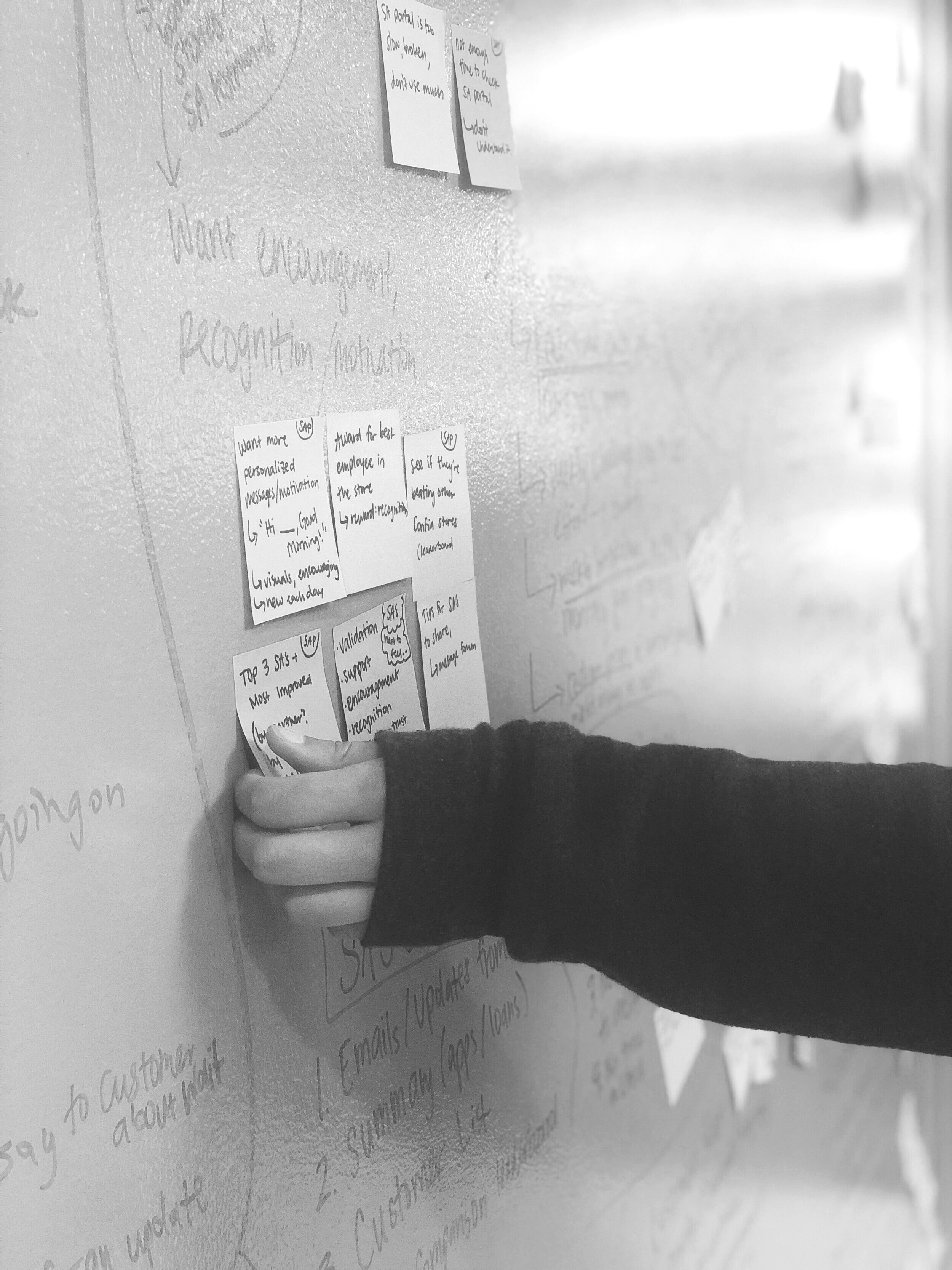
Now that we knew more about Agent pain points, we were ready to bring internal resources together to find solutions. By brainstorming and welcoming all ideas, we were able to uncover additional issues and ideate quickly!
Bringing cross-functional departments together was one of my favorite parts of the project!

The design-thinking brainstorm sessions were designed to solve the key pain points of the current Retail flow and understand the technical limitations. We included participants from across the organization including:
Product
Engineering
Customer Success
Growth & Marketing
QA
Account Management
Applicant Reviewers
Top-level insights included:
Reduce tablet connectivity to help with technical issues, slow page loading, and forced customer interaction
Give agents more guidance and control over the experience.
Show declines earlier instead of forcing agents & customers to go through unnecessary qualifications.
Agents with little-to-no experience can now follow a step by step application flow with minimal training.
Agents are empowered with new information such as informative tips and application statuses.
Reordered application questions to be more conversational. This is important since the agent is filling out the form for the customer.
More consistency in the conceptual model between what the agent and customer understand.
Fewer pages allowed for less loading time faster which was ideal for our low wifi partners. (Original product had 23 screens!)
Allow agents to start a lead if they do not have time to take an entire application


04. PROTOTYPE, TEST, ITERATE, REPEAT
Once we had a list of possible solutions, we dove into designs to test and iterate.
Some of our guiding principles were:
Give the agents the tools required to guide themselves and customers with confidence.
Frame the application questions to make the interaction comfortable, informal, and efficient.
Customers should have clarity throughout the loan application.
Engage the customer in an easy, respectful, and accessible way.
We gathered feedback by testing the prototypes on agents and internal teams until we were confident with our new designs.


05. ENGINEERING HANDOFF
Once we were ready to give designs to Engineering, we used Zeplin for clean and efficient handoff.


RETROSPECTIVE & NEXT STEPS
The redesign of the retail application was one of the largest and most successful projects that our design team conquered. I am so proud of not only what my team accomplished, but the impact it had on our users and business.
If I were to continue on this project further, the first thing I would do is get agent feedback with more user testing and improve the UI to be more friendly and fun. All-in-all this was a challenging but rewarding project which I learned a great deal from. A special thank you to Tara Chandi for working with me side-by-side through it all!
