
AURA rebrand

OVERVIEW
Aura (previously known as Lendify) wanted to move their products from a white-label brand to a full-featured brand.
PROBLEM
Lendify’s brand was optimized for co-branding, however, with growth came a need for more brand presence to help build customer loyalty and trust. As we took on new partnerships, customers applied for new loans through a different partner. Not knowing the loan was from the same company they were declined. This not only caused confusion but frustration for both the customer and the partner agent.
OUTCOME
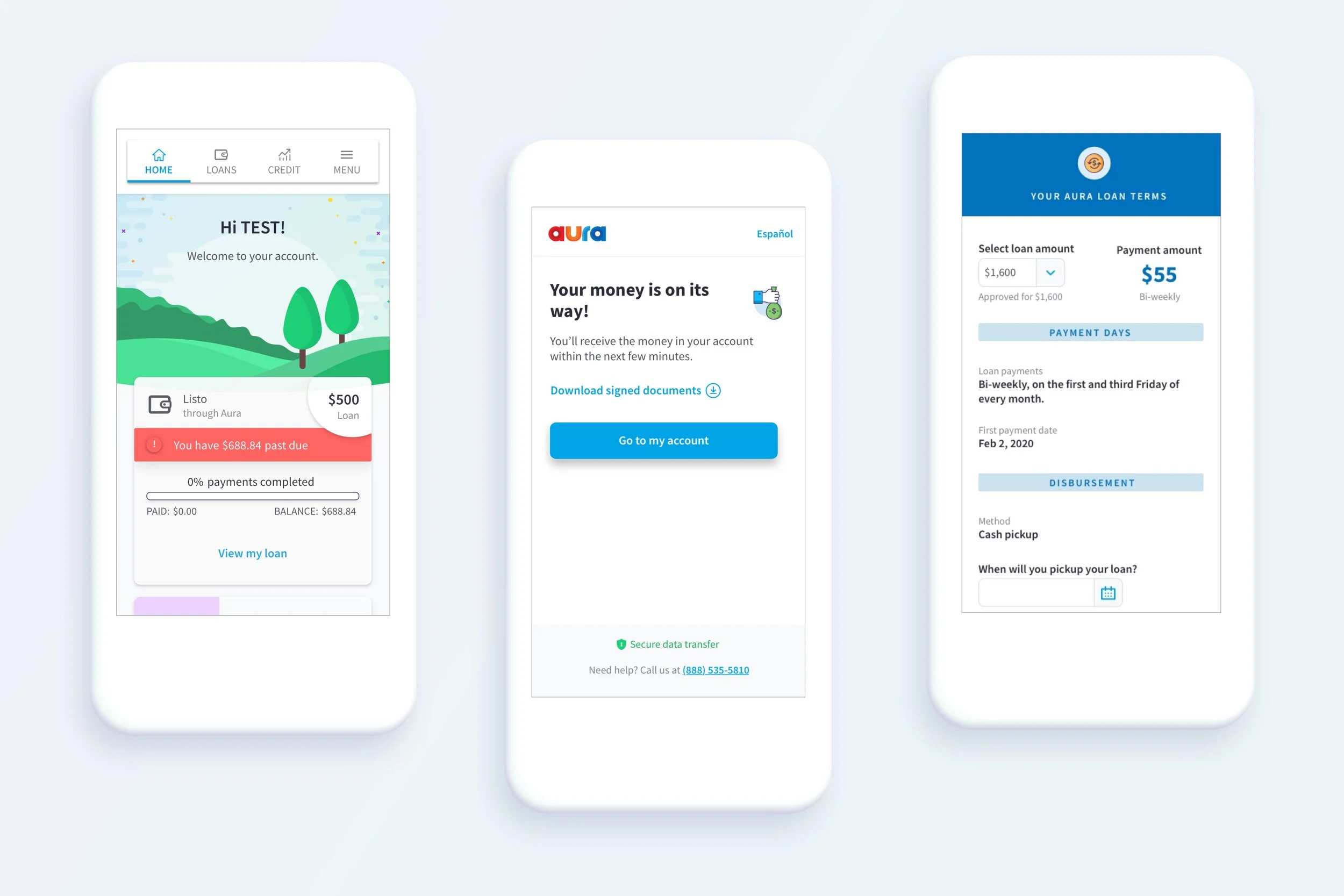
A branded experience! A brand book was created along with new marketing material and updated digital product UI. In order to update our digital products the Design and Product team strategically mapped out user flows to create a seamless brand experience. To read more about how we turned our siloed products into an omnichannel experience, visit the Designing Aura's Omnichannel Experience project.

Click to view brand book PDF
ROLE
Product Designer in collaboration with Senior Visual Designer Yasmin Amer.
DESIGN PROCESS
01. DEFINE
Before we could begin designing with our new brand, we needed to establish a few things:
Who should the brand be optimized for?
What is the business goal? Why is this important?
What are the brand attributes?
Brand Optimization
We decided to focus our efforts on our Applicants and Borrowers since they interact with most of the channels and products. This meant that external-facing software and marketing material needed to be aligned.
Business Goal and Impact
In order to allow for new growth opportunities, Aura needed to establish a strong brand presence that people could trust.
increase customer loyalty and drive business growth
Create brand awareness
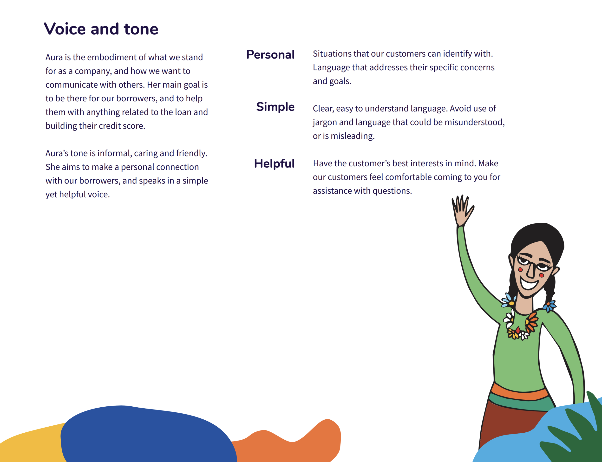
Brand Attribute Alignment Workshop

After many discussions between the Marketing and Design teams, I noticed a disconnect between who Aura was and how we thought ‘she’ should be represented (we always treated our brand as a person to humanize the outcome). I decided to host a workshop to bring alignment and buy-in from both teams.

During this workshop, we established brand attributes that described Aura’s values, personality, purpose, language, and tone. We used them as our guide to define who Aura is, and how we wanted ‘her’ to be perceived by our borrowers and sale associates.


Brand Attribute Outcome

02. DISCOVER
Now that the team was aligned on Brand Attributes, we wanted to build empathy with our customers before making decisions. We did this by conducting one-on-one qualitative interviews with customers and facilitating an empathy mapping exercise internally.


Now that we had brand attributes and customer empathy, we were almost ready to start designing. We found looking at the competitive landscape was useful for distinguishing what we wanted for our look and feel.
Examples from our competitor landscape


03. ITERATE
During this phase of the project, the entire design team worked on many iterations and explorations. This not only helped us see what would/would not work with our products but enabled us to make mistakes quickly to succeed faster!
The brand foundation given to us by a third party had many illustrative characteristics that were difficult to scale and reproduce. This forced us to find a solution that was reproducible but still friendly and approachable. This is why our rebrand had many organic and fluid shapes.
Example of Marketing Explorations

Branding Landscape


Example of Product Design Explorations


After many explorations, we decided to use the current design system and update it with Aura Illustrations and color palette. This allowed us to move quickly and implement changes with little engineering effort.
04. IMPLEMENTATION
I worked closely with Marketing, Product, and Engineering to make sure we had realistic deadlines, smooth implementation, and covered all company requirements.
Since this was an all-encompassing project, implementation would happen periodically, however, we did prioritize updating the UI for the applicant and borrower user flows. If you’d like to learn more about that experience and the necessary steps taken in order to do this, visit my Designing Aura's Omnichannel Experience project.
While Product and Design focused on implementing a new Aura brand across our products, our Senior Visual Designer put together our Brand Book to be used externally and internally.


Before Brand Alignment

After Brand Alignment


NEXT STEPS & RETROSPECTIVE
The next step would be to implement new UI components across all products and build a new design system with all Aura components.
Overall this was a very challenging and rewarding project. The challenge came from designing a system that was aligned with the companies brand definition, flexible to work with our current products, and scalable to work for future products.